
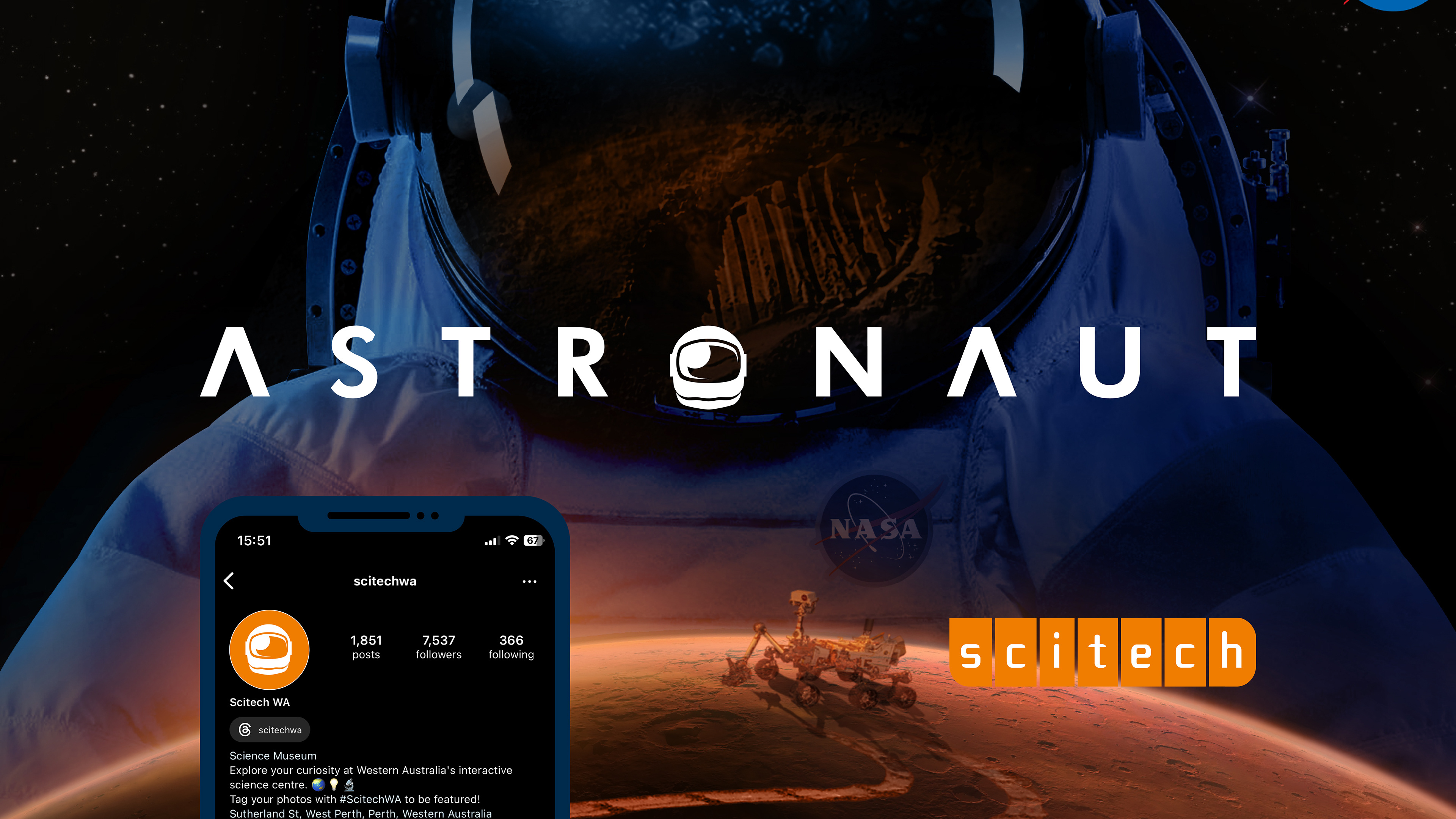
Scitech's Astronaut brand was designed to be playful and inspiring, yet retain a serious tone for its space-themed science exhibit. This balance allows the brand to stand confidently alongside logos of established space programs such as NASA and JAXA.
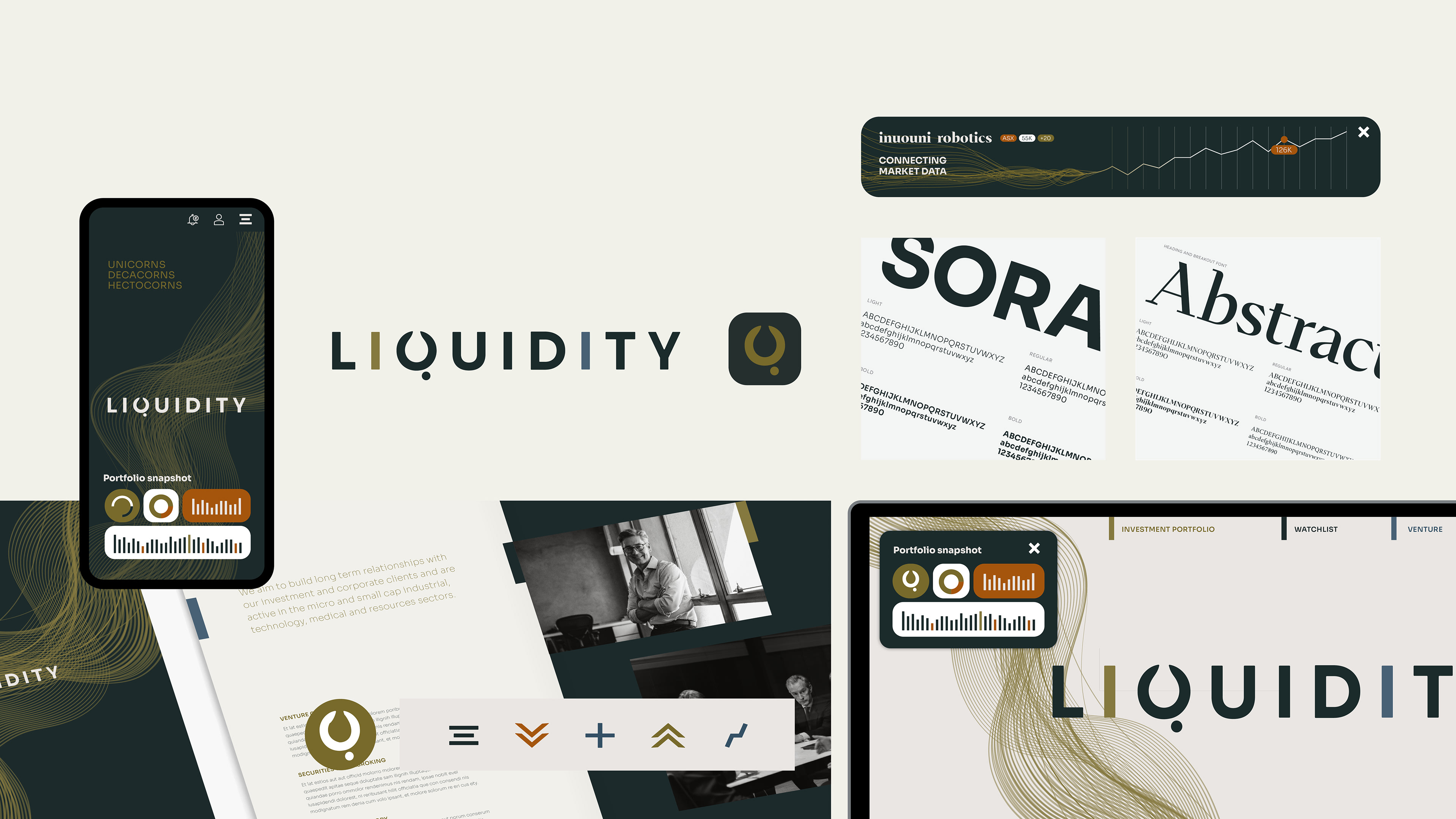
Liquidity, a brand concept I developed at Juicebox Agency, aimed to appeal to sophisticated investors with a clean, dynamic aesthetic. The logo's three "i"s form a versatile design element for dividing pages and menus, while animated flow lines seamlessly transition into investment data graphs. Variable fonts ensure the website adapts flawlessly to any device. The "Q" cleverly incorporates both a liquid droplet and a hidden bull (representing bullish trading), creating a memorable and instantly recognizable app icon. While the brand evolved during development, you can see the final result on the Juicebox website.
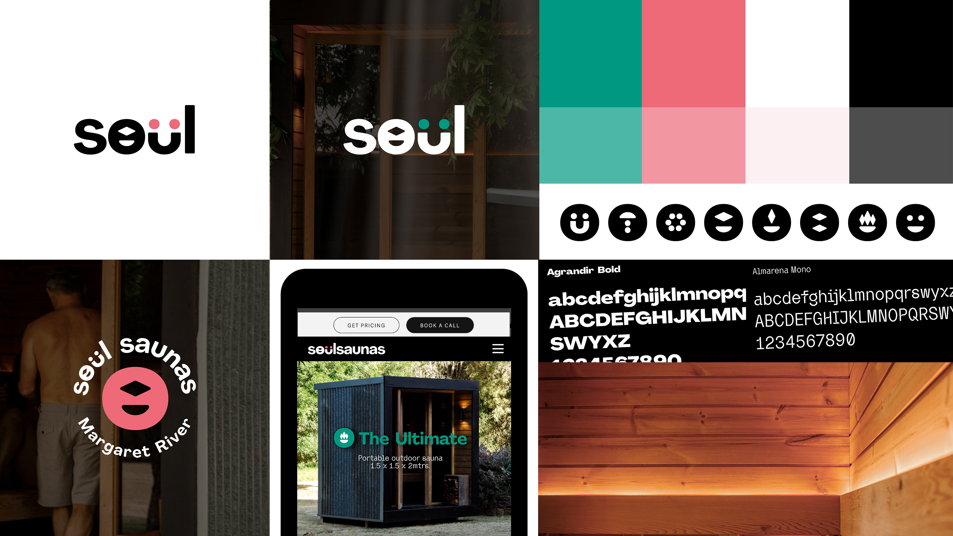
Soul Saunas was a quick branding exercise designed to help a friend expand their vision beyond a simple logo. They requested symbolism for "Salt" (the O) and "Purify" (the U), which I delivered in the design above. I aimed to inject a touch of playfulness into the brand, using modern type, colors, and a smiling "Purify" symbol, while maintaining a professional look. The "Salt" O, inspired by both salt and a heated water building, allowed me to create a suite of unique branded icons symbolising elements like fire, friendship, water, happiness, steam, and heat.
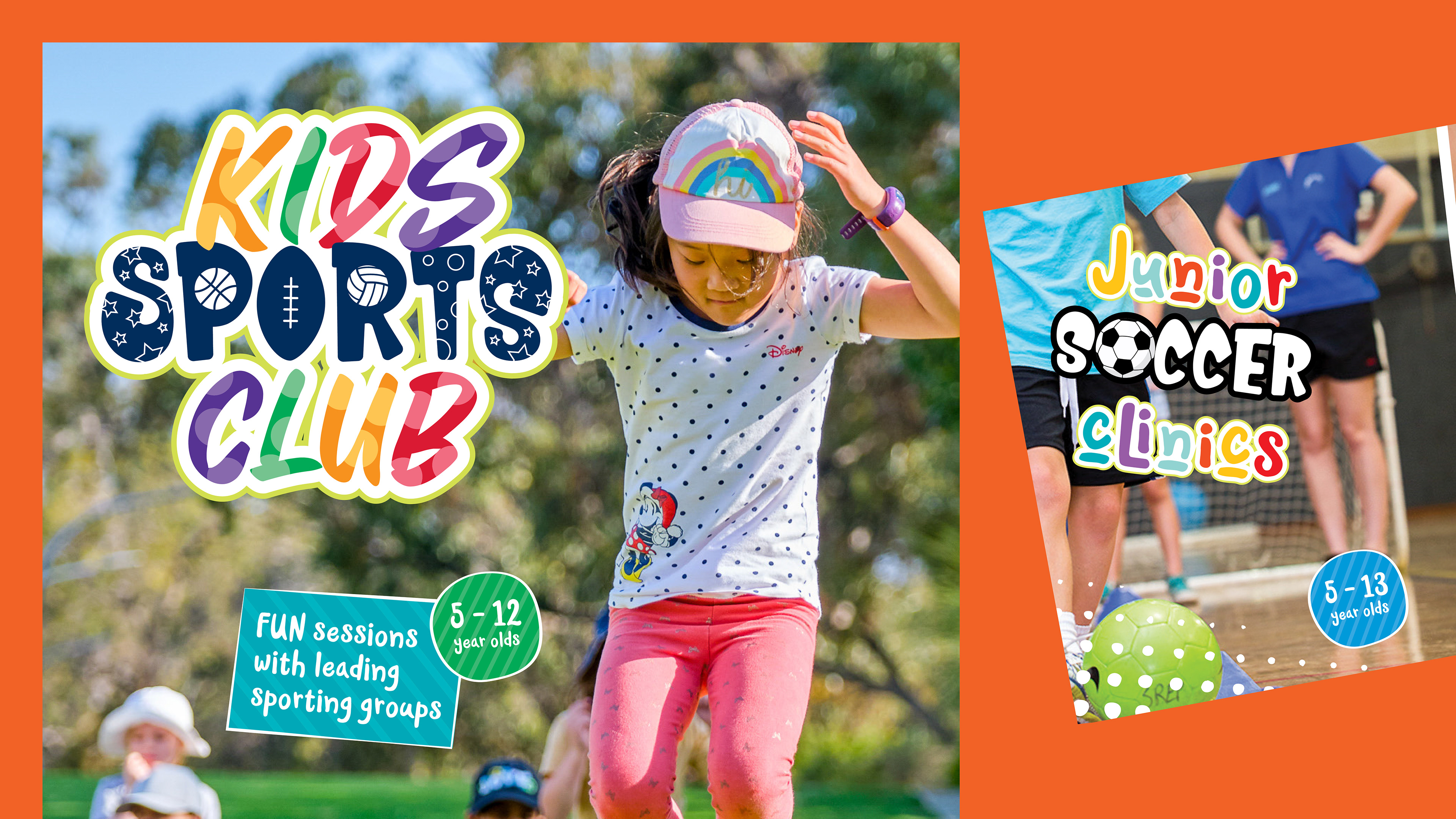
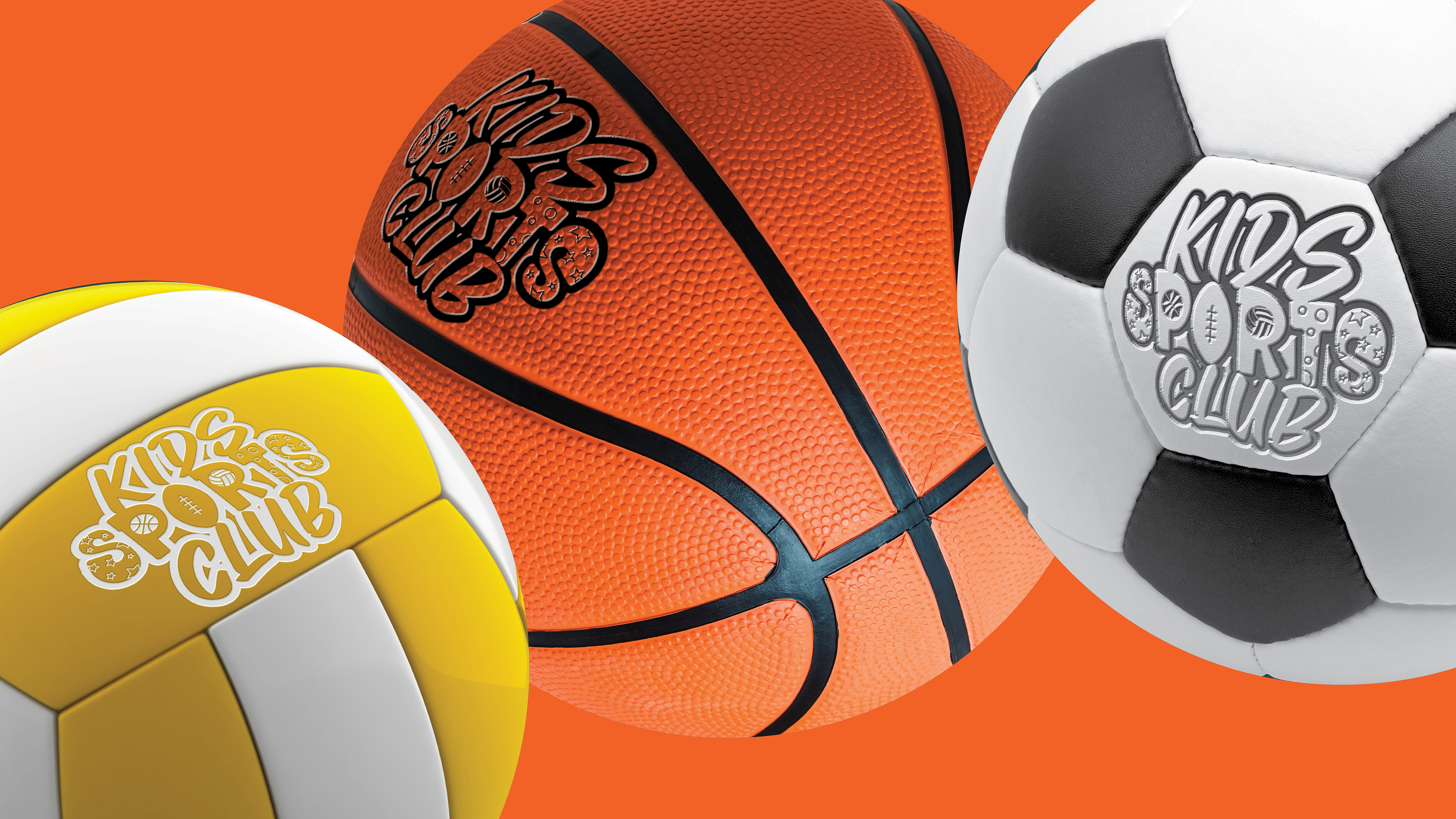
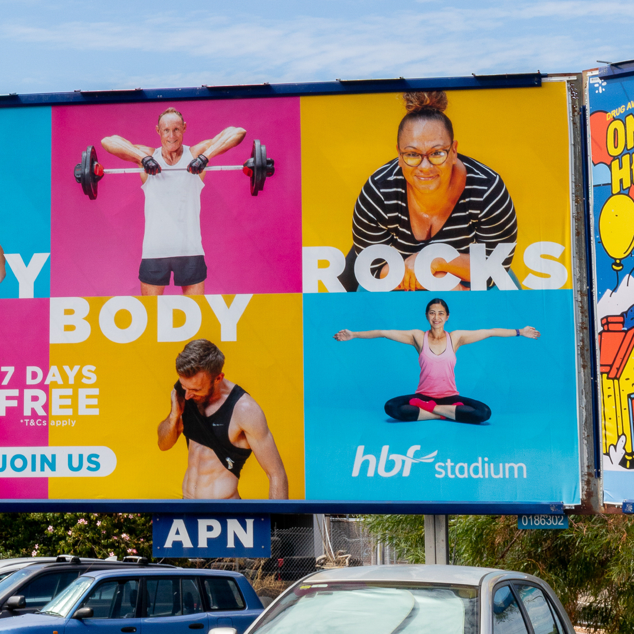
This project involved creating a comprehensive brand for the HBF Stadium Kids School Holiday Program at VenuesWest. The branding included: Sub-branding for each sports program: This ensured clear differentiation between the various activities offered. Large floor decals: These playful decals, designed like stepping stones, guided children towards different sports areas.Digital animated logos and videos: Eye-catching animations were created to promote the program across digital marketing channels.This multi-faceted approach aimed to engage mums of young audiences and effectively communicate the diverse range of activities available during the school holidays.
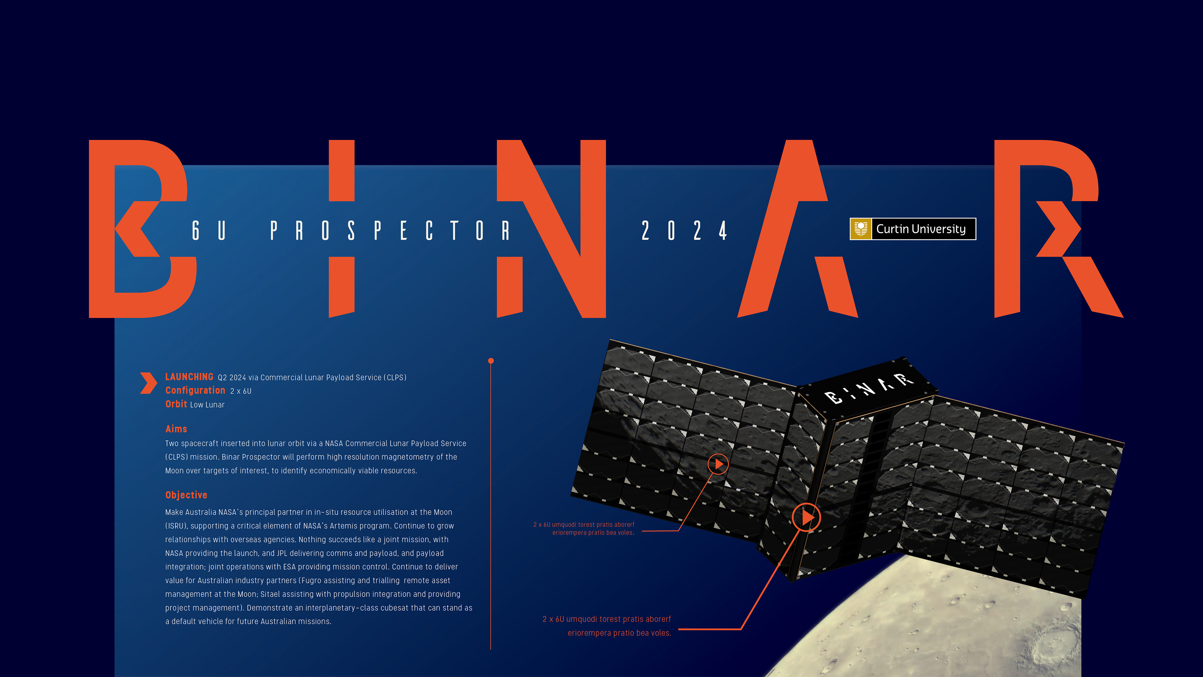
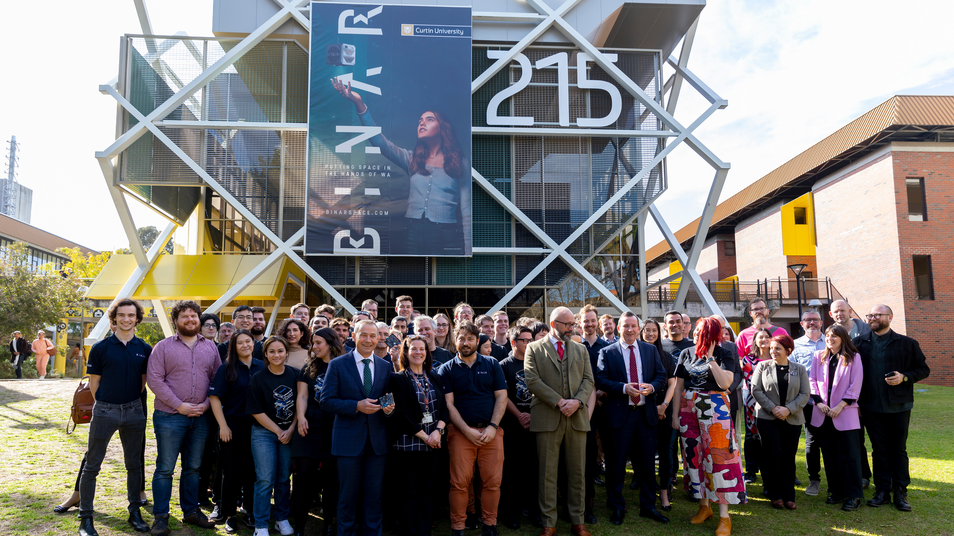

Binar, a brand I developed at Juicebox Agency, is the Noongar word for "fireball." This dynamic space program, based at Curtin University's Space Science and Technology Centre, is building the next generation of Australian small spacecraft. The brand's typemark incorporates the trajectory of 2 cubesats playing on negative and positive light and shadow, and the colour palette is inspired by the tones of Noongar ochre. I also created compelling video components to enhance the brand's visual identity. In 2021, a satellite delivered by SpaceX and launched on the ISS carried the Binar brand into space – a testament to its truly out-of-this-world reach.
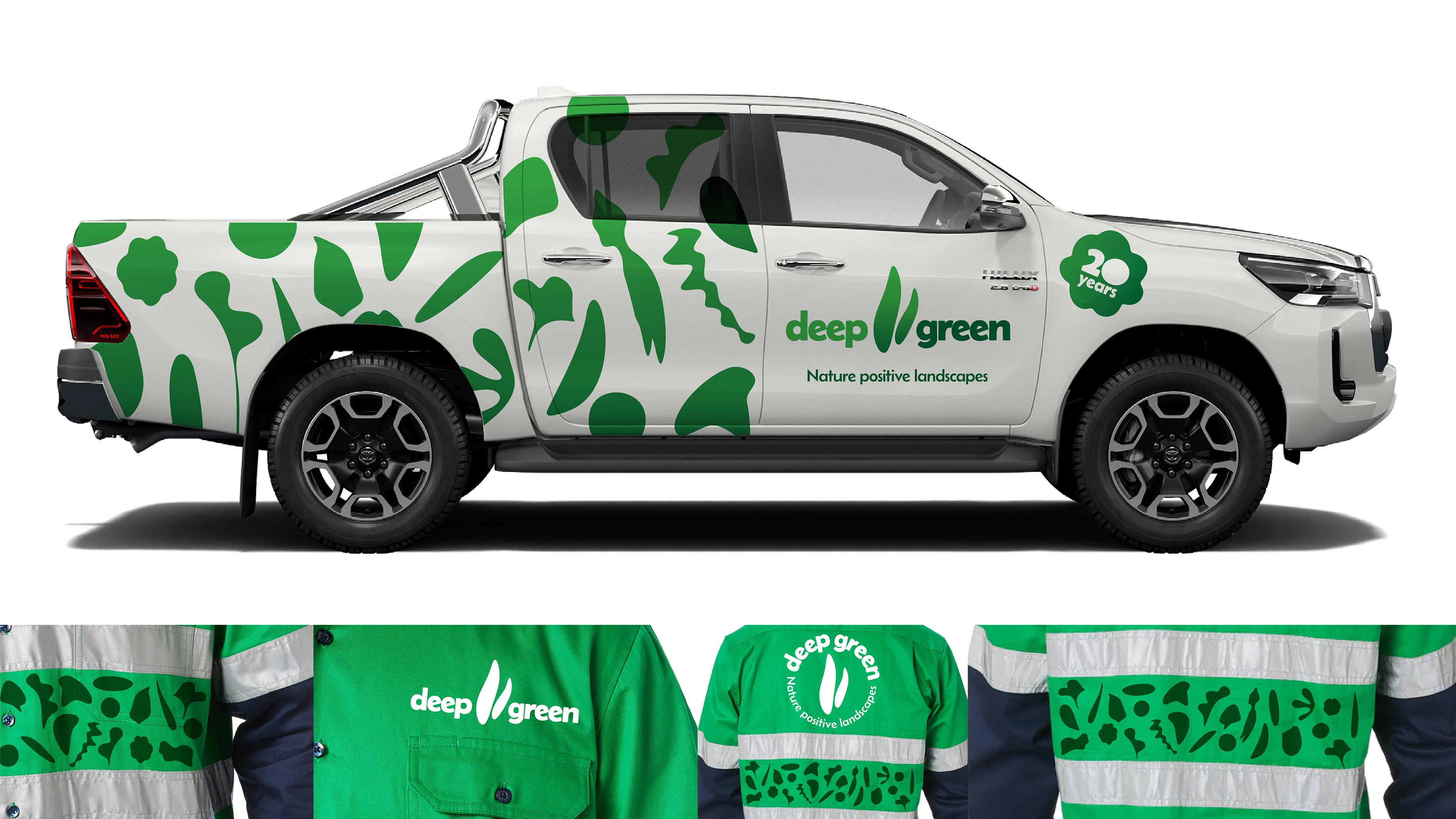
Deep Green Landscaping, Australia's leading commercial landscaper, I have evolved the logo and brand to better reflect its success and multi-million dollar contracts. The refined design features modernised, bold but soft typography for increased readability and impact. The simplified leaf mark retains its core identity, while a new graphic flora pattern adds visual distinction and seamlessly connects the brand across digital, signage, and uniforms.
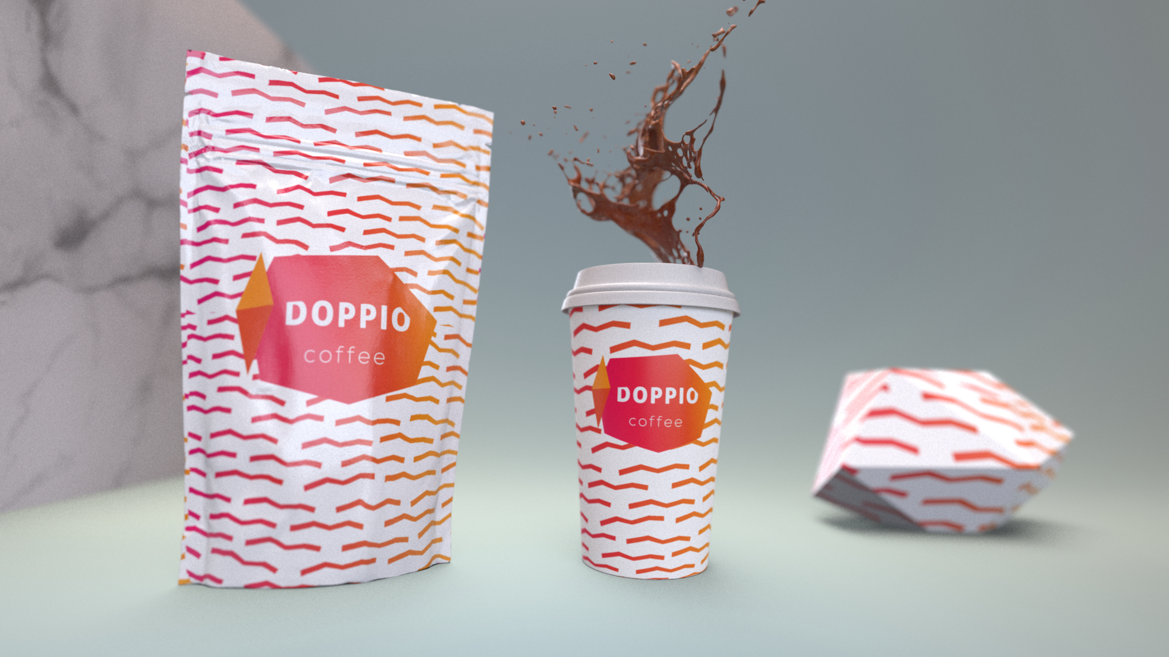
Doppio, a conceptual coffee brand, centers around its name (meaning "double espresso shot"). The logo features an abstract, low-polygon coffee cup design with the word "Doppio" cleverly integrated – the negative space reveals the rim of the cup. A distinct pattern, representing the aroma of freshly brewed coffee, complements the logo. Colours will change to reflect different flavour profiles, such as hints of raspberry and orange for this filter flavour.